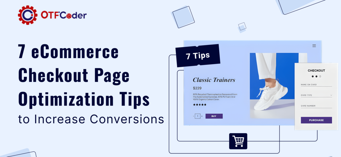
In the digital age, every aspect of an online store must be optimized for success, but most importantly the checkout page. It’s the final hurdle customers face before making a purchase. Enhance this critical part of the user journey with strategic improvements to boost conversions. Here’s how integrating WooCommerce payment gateways and refining ecommerce solutions can streamline the process.
1. Investing in a Good Payment Platform
The foundation of an effective checkout process is a strong payment platform. Utilizing a reliable WooCommerce payment gateway not only simplifies transactions but also ensures compatibility and security for various payment methods. This integration significantly reduces cart abandonment by offering a seamless payment experience that keeps pace with customer expectations and emerging trends.
2. Simplifying Checkout Procedures
Streamlining checkout procedures means minimizing the steps to purchase. This can include auto-filling information for returning customers, offering guest checkout options, and eliminating unnecessary fields. The goal is to make the buying process as quick and hassle-free as possible, encouraging more completed purchases.
3. Prioritizing Transparency during Checkout
Customers appreciate transparency, especially when it comes to costs. Ensure that your checkout page clearly displays all charges, including shipping, taxes, and any additional fees. Surprises at the payment stage can lead to cart abandonment, so clarity here can directly boost conversion rates.
4. Displaying Proof of Security
Displaying trusted security badges on your checkout page is very important. This reassures customers that their personal and payment information is safe. Certifications like SSL certificates, PCI compliance, and well-known security badges can help in building this trust.
5. Mobile Responsive Checkout Design
With an increasing number of transactions conducted on mobile devices, a mobile-responsive checkout design is essential. Ensure that your checkout page looks great and functions smoothly on all devices. This adaptation not only improves the user experience but also caters to the large segment of mobile shoppers.
6. Wise Use of Error Messages
Error messages should guide users to quickly resolve issues that arise during the checkout process. They need to be clear, concise, and helpful, providing direct solutions rather than vague feedback. This can prevent frustration and help keep the checkout flow smooth and uninterrupted.
7. Continuous Testing and Optimization
The ecommerce landscape is constantly evolving, so should your checkout process. Regularly test and optimize your checkout page for performance. A/B testing different elements can reveal what works best for your audience, leading to better user experiences and increased sales.
Conclusion
Optimizing your ecommerce checkout page is a continuous effort that can significantly impact your conversion rates. By investing in a solid WooCommerce payment gateway, simplifying procedures, ensuring transparency, enhancing security, adapting to mobile users, using error messages wisely, and continuously testing, you can create a checkout process that converts visitors into loyal customers. Start implementing these strategies today to see a considerable improvement in your ecommerce success.

